• Legal Notice – MuscleMecca Forums

    MuscleMecca.com is an educational discussion platform. We do not sell, promote, or endorse any bodybuilding gear, supplements, research chemicals, or performance-enhancing substances.

    All discussions are for educational and informational purposes only. Nothing posted on this forum should be considered medical or legal advice.

    Do not attempt to sell, source, or promote illegal substances. Any such activity will result in an immediate and permanent ban and may be reported to the proper authorities.

    By using this site, you agree to comply with all forum rules, disclaimers, and applicable laws in your jurisdiction.

    Read Our Full Disclaimer and Forum Rules

  • Follow the 2026 Olympia on September 24 to 27, 2026!

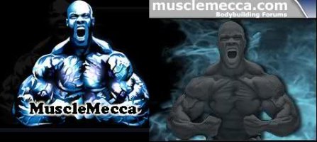
Old logo vs New logo

Daniel Andersson

Daniel Andersson

Mecca Mod (not)
VIP
Joined
Oct 30, 2006
Messages
8,184
Points
63
They are both awesome..but I like the new one best :keke::xyxthumbs:
 
Johnny Bravo

Johnny Bravo

Mecca V.I.P.
VIP
Joined
Jul 12, 2006
Messages
3,040
Points
38
The new one. But I would like to see some colors in it.
 
Deathmaggot

Deathmaggot

Mecca V.I.P.
VIP
Joined
Sep 24, 2006
Messages
1,262
Points
38
im used to the old one, but the 2nd one has more potential

imagine the new one coloured as the 1st one
 

MuscleMecca Crew

Mecca Staff
Daniel Andersson

Daniel Andersson

Mecca Mod (not)
VIP
Joined
Oct 30, 2006
Messages
8,184
Points
63
That could work :dunnodude:
 
Line

Line

Chaos reigns.
VIP
Joined
Jul 11, 2006
Messages
6,255
Points
38
I feel the new logo far surpasses the old one.
 
JS316

JS316

Mecca V.I.P.
VIP
Joined
Aug 10, 2006
Messages
773
Points
16
new logo is really nice pain...really sharp
 
German_Joe

German_Joe

Mecca V.I.P.
VIP
Joined
Jul 16, 2006
Messages
1,032
Points
38
the entire layout is pretty sexy:gaygay:
 
Skeptic

Skeptic

I am god.
VIP
Joined
Dec 23, 2007
Messages
7,444
Points
38
It all looks good, but yes not necessarily colour... just highlights through the logo would make it look more striking. It doesnt stand out as much as it should.
 
skid9832004

skid9832004

Well-known member
Member
Joined
Jan 12, 2007
Messages
337
Points
16
i got an idea take the musclemecca.com text on the new 1 and put "muscle" on the upper left side of phil heath and the "mecca" part on the upper right side of him and the ".com" part of it in between his 2 hands in the pose. That would look great!
 
TJ

TJ

Mecca V.I.P.
VIP
Joined
Jul 13, 2006
Messages
1,235
Points
38
I think the background is badass. The pic of Phil is pretty cool and goes well with the background, too.
 
patdiddy

patdiddy

Mecca V.I.P.
VIP
Joined
Jul 20, 2006
Messages
1,111
Points
38
I like the new one but it should have just a little bit more color as some have suggested. I like it though.
 

Similar threads

dilatedmuscle
Replies
7
Views
4K
JoaoT
JoaoT
Top